Volcano Plot with R
By Saulo Gil
October 1, 2023
Volcano Plot with R
What’s that for??
A volcano plot is a type of scatter-plot that is used to identify changes in large data sets. It is very used by bioinformatic researches when analyzing data from “omics” technologies (e.g., genomics, proteomics, metabolomics, metagenomics, phenomics and transcriptomics). It plots significance versus fold-change on the y and x axes, respectively. It enables quick visual identification of genes with large fold changes that are also statistically significant.
Briefly, in a volcano plot, the most upregulated genes are towards the right, the most downregulated genes are towards the left, and the most statistically significant genes are towards the top.
The R, especially the dplyr and ggplot2 packages (both from Tidyverse), are very useful for creating beautiful and useful volcano plots.
Herein, I replicated the codes from a wonderful tutorial to create a volcano plot from Erika Duan which I strongly recommend see it for details click here to acess!!!
SO, LET’S TO DO IT
Packages required
library(tidyverse)
library(janitor)# Cleaning column names
library(scales)# Transform axis scales
library(ggrepel)# Optimise plot label separation
Import a test dataset
Firstly, we need to access the dataset!
The dataset used to create volcano plot is from study of Fu et at. (2025) intitle EGF-mediated induction of Mcl-1 at the switch to lactation is essential for alveolar cell survival. This study explored the role and regulation of Mcl-1 in mammopoiesis and the RNA-seq dataset can be accessed and downloaded on this site.
But…I don’t understand anything about the topic!!!!

No problem, neither do I but we don’t need to understand it to create a beautiful Volcano plot!
# Load dataset -----------------------------------------------------------------
samples <- read_delim("raw_data/limma-voom_luminalpregnant-luminallactate",
    delim = "\t",
    escape_double = FALSE,
    trim_ws = TRUE)

# Clean column names -----------------------------------------------------------
# Convert columns names to snake case by default using clean_names()
samples <- clean_names(samples)

# Manually edit column names using rename()
samples <- samples |>
  rename(entrez_id = entrezid, # from entrezid to entrez_id
         gene_name = genename)  # from genename to gene_name
Let’s see the dataset!
# Visualise the dataset as a table ---------------------------------------------
# round numeric values
samples |>
  mutate(
    log_fc = round(log_fc, digits = 2),
    ave_expr = round(ave_expr, digits = 2),
    t = round(t, digits = 2),
    p_value = round(p_value, digits = 2),
    adj_p_val = round(adj_p_val, digits = 2)
  ) |>
  DT::datatable()
The data contains the following columns:
- Entrez ID - stores the unique gene ID;
- Gene symbol - stores the gene symbol associated with an unique Entrez ID;
- Gene name - stores the gene name associated with an unique Entrez ID;
- log2(Fold change) - stores the log2-transformed change in gene expression level between two types of tissue samples;
- Adjusted p-value - stores the p-value adjusted with a false discovery rate (FDR) correction for multiple testing.
Basic Volcano Plot
As before mentioned, the volcano plot display the significance data (i.e., adjusted p-value) versus the fold-change [i.e., log2(Fold change)] on the y and x axes, respectively.
Note: The transformation -log10(adj_p_val) allows points on the plot to project upwards as the fold change increases or decreases in magnitude.
Our first Volcano plot
# volcano plot -------------------------------------------------
vol_plot <-
  samples |>
  ggplot(aes(x = log_fc,
             y = -log10(adj_p_val))) + # Transformation -log10(adj_p_val)
  geom_point() +
  theme_bw()

vol_plot # Visualise ggplot output
It appears very simple and uninformative! But there is good news, it can be improved a lot!
Add horizontal and vertical lines
It is very common to determine cutoffs for adjusted p-value and log_fc.
Let’s to insert these cutoffs:
- adj_p_value <= 0.05;
- log_fc <= -1 (i.e., downregulated);
- log_fc >= 1 (i.e., upregulated);
# Plot extra quadrants ---------------------------------------------------------
vol_plot +
  geom_hline(yintercept = -log10(0.05), # horizontal line
             linetype = "dashed") +
  geom_vline(xintercept = c(log2(0.5), log2(2)), # vertical line
             linetype = "dashed")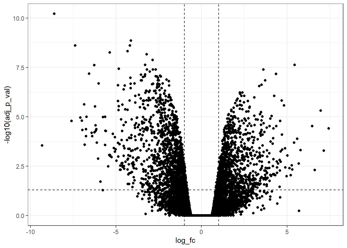
Now, we can observe that there are a lot of genes upregulated and downregulated according to the predetermined cutoff.
But, it still is possible to improve more!!!
Modify the x-axis and y-axis
Symmetrical axes are fundamental in this type of plot!
So, let’s set it!!!
# Identify the best range for xlim() -------------------------------------------
samples |>
  select(log_fc) |>
  min() |>
  floor()
## [1] -10samples |>
select(log_fc) |>
max() |>
ceiling()## [1] 8c(-10, 8) |>
abs() |>
max()## [1] 10# Modify xlim() ----------------------------------------------------------------
# Manually specify x-axis limits
vol_plot +
geom_hline(yintercept = -log10(0.05),
linetype = "dashed") +
geom_vline(xintercept = c(log2(0.5), log2(2)),
linetype = "dashed") +
xlim(-10, 10)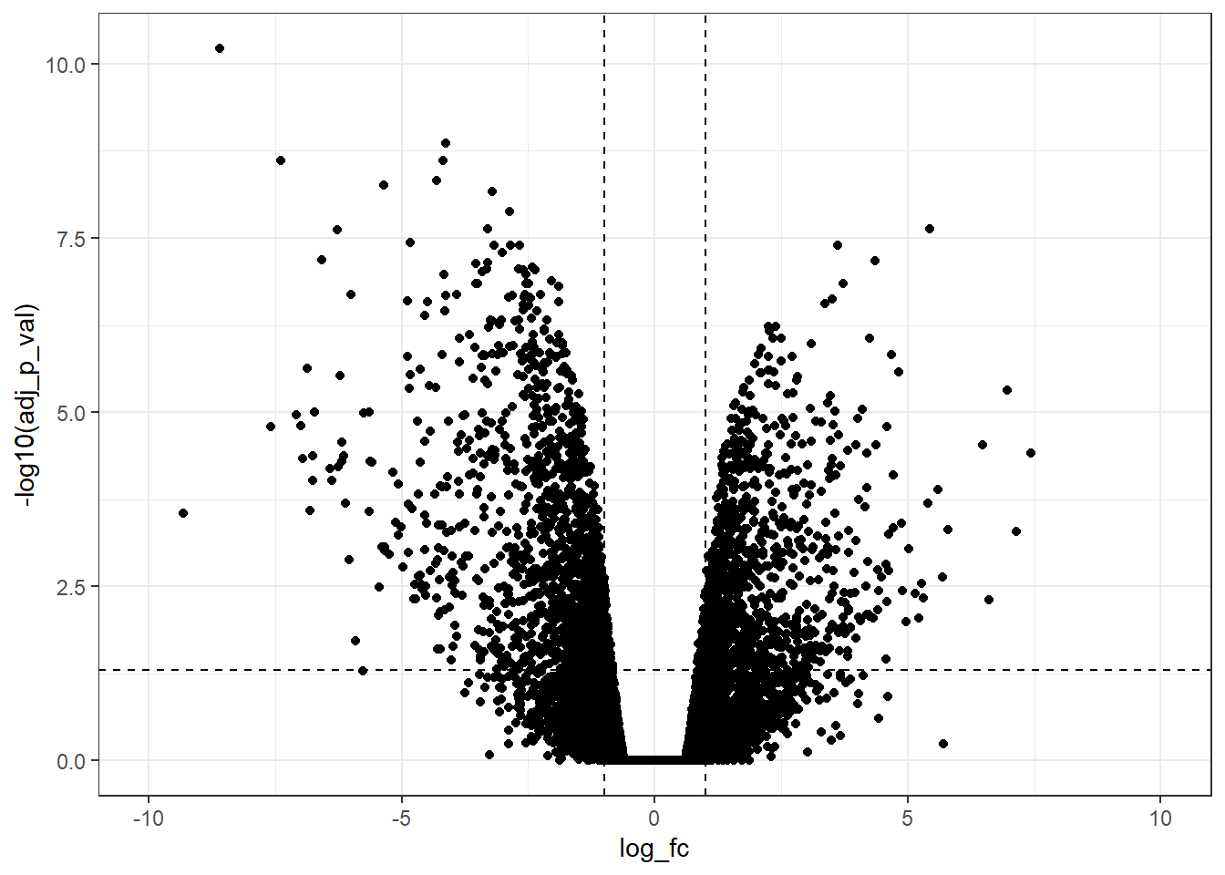
Furthermore, it is possible to change the limits of the x-axis with more ticks.
# Modify scale_x_continuous() --------------------------------------------------
vol_plot +
  geom_hline(yintercept = -log10(0.05),
             linetype = "dashed") +
  geom_vline(xintercept = c(log2(0.5), log2(2)),
             linetype = "dashed") +
  scale_x_continuous(breaks = c(seq(-10, 10, 1)), # Modify x-axis tick intervals
                     limits = c(-10, 10)) # Modify xlim() range
NICE!!!
Now, we have a good volcano plot! Let’s to customize others details to make it more informative!
Colour, size and transparency
To add color, size, and transparency are useful strategies to visualize different gene groups. But, first, we need to categorize genes into different groups and store these categories as a new column of data.
- Genes with log_fc >= 1 & adj_p_val <= 0.05 as up;
- Genes with log_fc <= -1 & adj_p_val <= 0.05 as down;
- All other genes labelled as ns i.e. non-significant;
# Create new categorical column ------------------------------------------------
samples <-
  samples |>
  mutate(gene_type = case_when(log_fc >= 1 & adj_p_val <= 0.05 ~ "upregulated",
                               log_fc <= -1 & adj_p_val <= 0.05 ~ "downregulated",
                               TRUE ~ "ns"))

# Count gene_type categories ---------------------------------------------------
samples |>
  count(gene_type) |>
  DT::datatable(caption = "Table 2. Number of downregulated, upregulated and non-significant manner regulated genes")
Now, let’s to customize adding color, size, and transparency!
# Add colour, size and alpha (transparency) to volcano plot --------------------
cols <- c("upregulated" = "#ffad73",
          "downregulated" = "#26b3ff",
          "ns" = "grey")

sizes <- c("upregulated" = 2,
           "downregulated" = 2,
           "ns" = 1)

alphas <- c("upregulated" = 1,
            "downregulated" = 1,
            "ns" = 0.5)

samples |>
  ggplot(aes(x = log_fc,
             y = -log10(adj_p_val),
             fill = gene_type,
             size = gene_type,
             alpha = gene_type)) +
  geom_point(shape = 21, # Specify shape and colour as fixed local parameters
             colour = "black") +
  geom_hline(yintercept = -log10(0.05),
             linetype = "dashed") +
  geom_vline(xintercept = c(log2(0.5), log2(2)),
             linetype = "dashed") +
  scale_fill_manual(values = cols) + # Modify point colour
  scale_size_manual(values = sizes) + # Modify point size
  scale_alpha_manual(values = alphas) + # Modify point transparency
  scale_x_continuous(breaks = c(seq(-10, 10, 1)),
                     limits = c(-10, 10))+
theme_bw()![]()
Label points of interest - The most useful tool!
# Define another subset of interest from the original data ---------------------
sig_il_genes <-
  samples |>
  filter(symbol %in% c("Il15",
                       "Il34",
                       "Il24"))

up_il_genes <-
  samples |>
  filter(symbol == "Il24")

down_il_genes <-
  samples |>
  filter(symbol %in% c("Il15",
                       "Il34"))

# Modify legend labels by re-ordering gene_type levels -------------------------
samples <-
  samples |>
  mutate(gene_type = fct_relevel(gene_type, "upregulated", "downregulated"))

ggplot(data = samples,
       aes(x = log_fc,
           y = -log10(adj_p_val))) +
  geom_point(aes(colour = gene_type),
             alpha = 0.2,
             shape = 16,
             size = 1) +
  geom_point(data = up_il_genes,
             shape = 21,
             size = 2,
             fill = "firebrick",
             colour = "black") +
  geom_point(data = down_il_genes,
             shape = 21,
             size = 2,
             fill = "steelblue",
             colour = "black") +
  geom_hline(yintercept = -log10(0.05),
             linetype = "dashed") +
  geom_vline(xintercept = c(log2(0.5), log2(2)),
             linetype = "dashed") +
  geom_label_repel(data = sig_il_genes, # Add labels last so they appear as the top layer
                   aes(label = symbol),
                   force = 2,
                   nudge_y = 1) +
  scale_colour_manual(values = cols) +
  scale_x_continuous(breaks = c(seq(-10, 10, 2)),
                     limits = c(-10, 10)) +
  theme_bw() + # Select theme with a white background
  theme(panel.border = element_rect(colour = "black", fill = NA, size= 0.5),
        panel.grid.minor = element_blank(),
panel.grid.major = element_blank()) 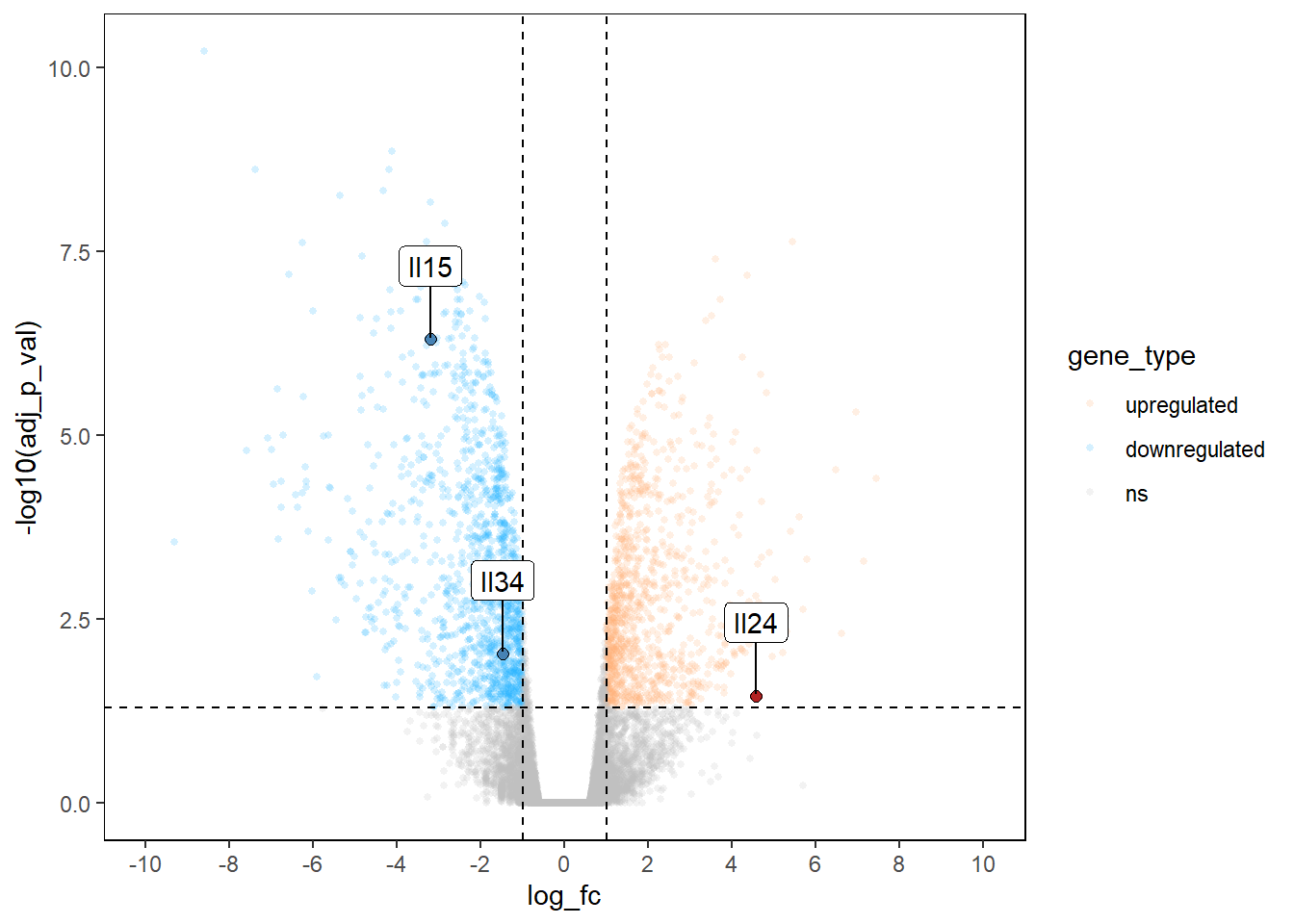
AMAZING VOLCANO PLOT!

So, that’s it!
Thanks again to Erika Duan for the amazing tutorial!

- Posted on:
- October 1, 2023
- Length:
- 271 minute read, 57706 words
- See Also: