Heart Disease Data set - An Unsupervised Learning Approach
By Saulo Gil
June 22, 2022
This project consists in an Unsupervised Learning analysis of the Heart Disease data set available in the UCI Machine Learning Repository.
This database contains 76 attributes, but all published experiments refer to using a subset of 14 of them. So, we opted to use just 14 tributes of the Cleveland database that are commonly used ML researchers.
The attributes are following:
age = age in years.
sex = sex (1 = male; 0 = female).
cp = chest pain type
Value 1: typical angina
Value 2: atypical angina
Value 3: non-anginal pain
Value 4: asymptomatic,
trestbps = resting blood pressure (in mm Hg on admission to the hospital),
chol = serum cholestoral in mg/dl,
fbs = fasting blood sugar > 120 mg/dl (1 = true; 0 = false),
restecg = resting electrocardiographic results,
thalach = maximum heart rate achieved,
exang = exercise induced angina (1 = yes; 0 = no),
oldpeak = ST depression induced by exercise relative to rest,
slope = the slope of the peak exercise ST segment,
ca = number of major vessels (0-3) colored by flourosopy,
thal = 3 = normal; 6 = fixed defect; 7 = reversable defect,
num = diagnosis of heart disease (angiographic disease status)(1 = true; 0 = false)
LET’S START ❗️
Packages
library(tidyverse)
library(DT)
library(factoextra)
library(gridExtra)
Pre-processing
Loading and adjusting database
The dataset was downloaded here and, as dataset comes without column names, I included column names using r colnames function from {r base}. Then, I removed all categorical variables considering since that i intend to reduce the dimensionality of the data using Principal Component Analysis (PCA) which do not appear to be an adequate approach for categorical variables. More details may be checked here
data <-
  read_csv("processed.cleveland.data",
    col_names = FALSE)

colnames(data) <- c(
  "age",
  "sex",
  "cp",
  "trestbps",
  "chol",
  "fbs",
  "restecg",
  "thalach",
  "exang",
  "oldpeak",
  "slope",
  "ca",
  "thal",
  "num"
)

data <-
  data |>
  mutate(ca = as.double(ca)) |>
  select(-sex,
         -cp,
         -fbs,
         -exang,
         -thal,
         -num)
The filtered dataset can be checked above.
datatable(data = data, rownames = FALSE)Verifying missing values
DataExplorer::plot_missing(data) +
  theme_bw() +
  theme(legend.title = element_blank(),
        legend.position = "none")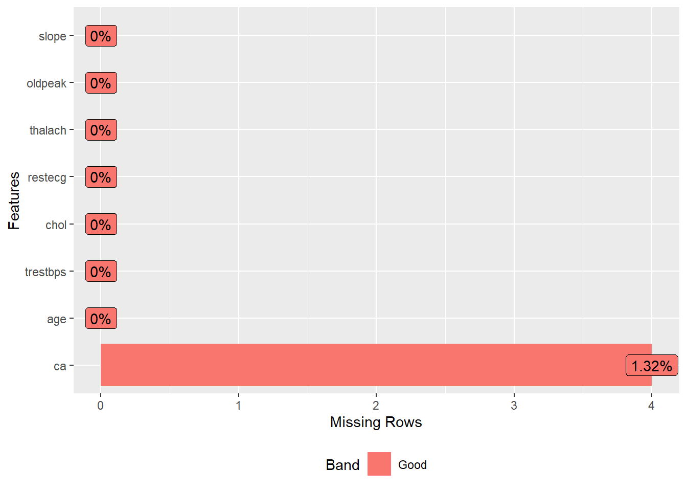
Looking missing value plot, we observed an low frequency of missing value in the variable ca, and I opted to remove then.
Removing missing data
data <-
  drop_na(data)
Lets see missing data again
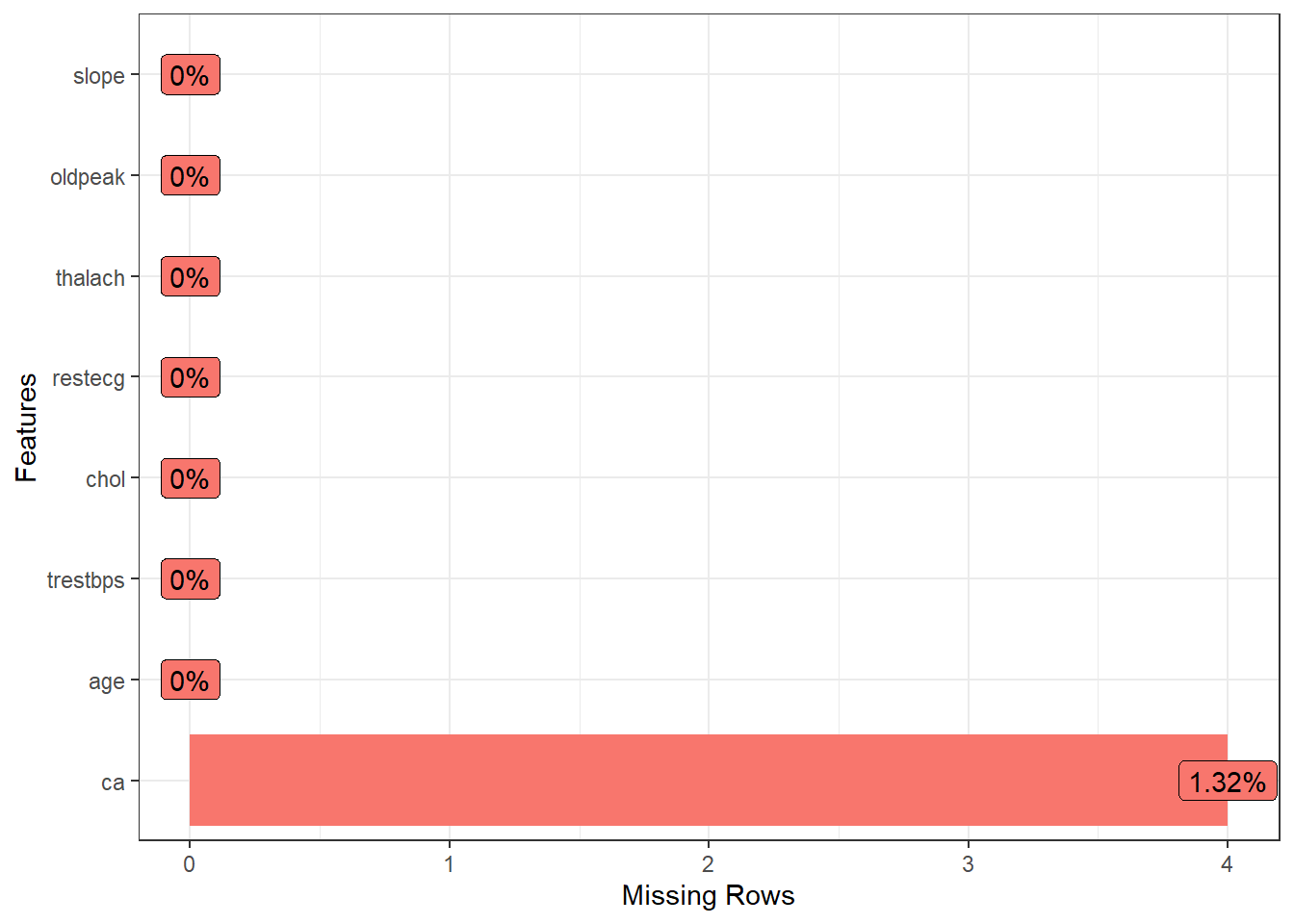
DataExplorer::plot_missing(data) +
  theme_bw() +
  theme(legend.title = element_blank(),
        legend.position = "none")
Yeah, now, we does not have missing values ❗️ Now, let’s to see data summary.
Data summary
skimr::skim(data)| Name | data |
| Number of rows | 299 |
| Number of columns | 8 |
| _______________________ | |
| Column type frequency: | |
| numeric | 8 |
| ________________________ | |
| Group variables | None |
Variable type: numeric
| skim_variable | n_missing | complete_rate | mean | sd | p0 | p25 | p50 | p75 | p100 | hist |
|---|---|---|---|---|---|---|---|---|---|---|
| age | 0 | 1 | 54.53 | 9.02 | 29 | 48 | 56.0 | 61.0 | 77.0 | ▁▅▇▇▁ |
| trestbps | 0 | 1 | 131.67 | 17.71 | 94 | 120 | 130.0 | 140.0 | 200.0 | ▃▇▅▁▁ |
| chol | 0 | 1 | 247.10 | 51.91 | 126 | 211 | 242.0 | 275.5 | 564.0 | ▃▇▂▁▁ |
| restecg | 0 | 1 | 1.00 | 0.99 | 0 | 0 | 1.0 | 2.0 | 2.0 | ▇▁▁▁▇ |
| thalach | 0 | 1 | 149.51 | 22.95 | 71 | 133 | 153.0 | 165.5 | 202.0 | ▁▂▅▇▂ |
| oldpeak | 0 | 1 | 1.05 | 1.16 | 0 | 0 | 0.8 | 1.6 | 6.2 | ▇▂▁▁▁ |
| slope | 0 | 1 | 1.60 | 0.62 | 1 | 1 | 2.0 | 2.0 | 3.0 | ▇▁▇▁▁ |
| ca | 0 | 1 | 0.67 | 0.94 | 0 | 0 | 0.0 | 1.0 | 3.0 | ▇▃▁▂▁ |
We may observed a wide range in the units of the variables. So, I opted to scale all variables in order to put then in standardized units, in the case, using z-score. Now, we may observe standardized units for all variables.
Now, let’s to reduce dimentionality ❗️
Scaling data - z-score approach
data_scaled <- scale(data)

skimr::skim(data_scaled)| Name | data_scaled |
| Number of rows | 299 |
| Number of columns | 8 |
| _______________________ | |
| Column type frequency: | |
| numeric | 8 |
| ________________________ | |
| Group variables | None |
Variable type: numeric
| skim_variable | n_missing | complete_rate | mean | sd | p0 | p25 | p50 | p75 | p100 | hist |
|---|---|---|---|---|---|---|---|---|---|---|
| age | 0 | 1 | 0 | 1 | -2.83 | -0.72 | 0.16 | 0.72 | 2.49 | ▁▅▇▇▁ |
| trestbps | 0 | 1 | 0 | 1 | -2.13 | -0.66 | -0.09 | 0.47 | 3.86 | ▃▇▅▁▁ |
| chol | 0 | 1 | 0 | 1 | -2.33 | -0.70 | -0.10 | 0.55 | 6.10 | ▃▇▂▁▁ |
| restecg | 0 | 1 | 0 | 1 | -1.00 | -1.00 | 0.00 | 1.01 | 1.01 | ▇▁▁▁▇ |
| thalach | 0 | 1 | 0 | 1 | -3.42 | -0.72 | 0.15 | 0.70 | 2.29 | ▁▂▅▇▂ |
| oldpeak | 0 | 1 | 0 | 1 | -0.90 | -0.90 | -0.22 | 0.47 | 4.42 | ▇▂▁▁▁ |
| slope | 0 | 1 | 0 | 1 | -0.97 | -0.97 | 0.64 | 0.64 | 2.26 | ▇▁▇▁▁ |
| ca | 0 | 1 | 0 | 1 | -0.72 | -0.72 | -0.72 | 0.35 | 2.48 | ▇▃▁▂▁ |
Reducing the dimensionality
Following to apply PCA and plot, we may observe that first component shows 30% of the variance while second component just 16%. Also, we are not able to identify any visual cluster. Therefore, let’s apply k-means and hierarchical clustering approaches in order to identify clusters.
Let’s start by hierarchical clustering.
In brief,
PCA <- princomp(data_scaled)

PCA |>
  fviz(element = "ind") +
  theme_bw()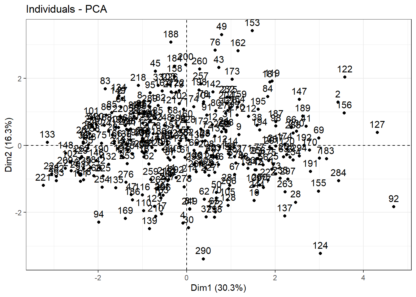
Clustering
Checking optimal number of clustering using Hierarchical Clustering
Hierarchical clustering is an unsupervised machine learning algorithm for identifying groups in the dataset. It does not require us to pre-specify the number of clusters to be generated. Furthermore, hierarchical clustering has an added advantage over other commonly used methods in that it results in an attractive tree-based representation of the observations, called a dendrogram. More details may be checked here
Firstly, let’s to determine optimal number of cluster elbow method. As we can observe above, the “elbow” is not clear. Let-s to see another method, i.e., silhouette method, to indicate optimal number of cluster.
fviz_nbclust(data_scaled, hcut, method = "wss")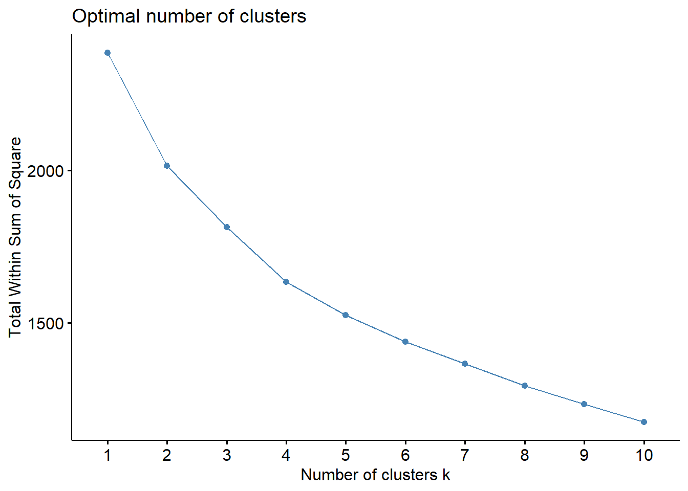
fviz_nbclust(data_scaled, hcut, method = "silhouette")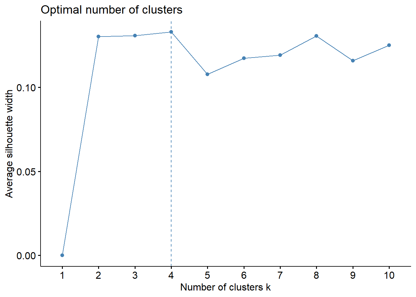
Despite of elbow and silhouette methods are not equivalent, i will used 4 cluster. Let’s to see dendrogram and
#hierarchichal clustering using k = 4

hc <- hcut(data_scaled, k = 4,
           hc_method = "ward.D2",
           hc_metric = "euclidean")

# Plot the obtained dendrogram
plot(hc, cex = 0.6, hang = -10)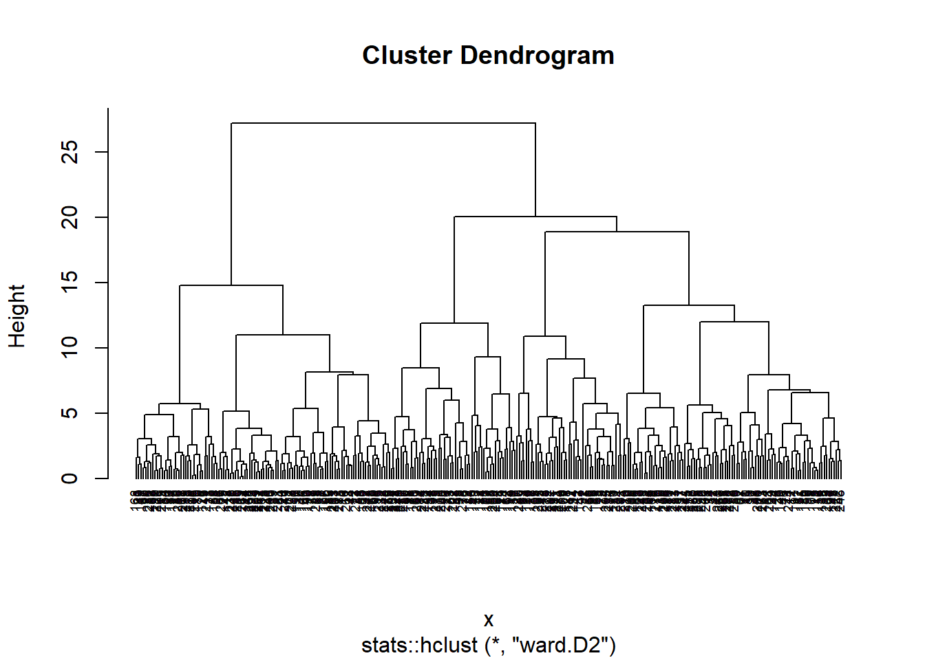
fviz_cluster(hc, data = data_scaled) +
theme_bw()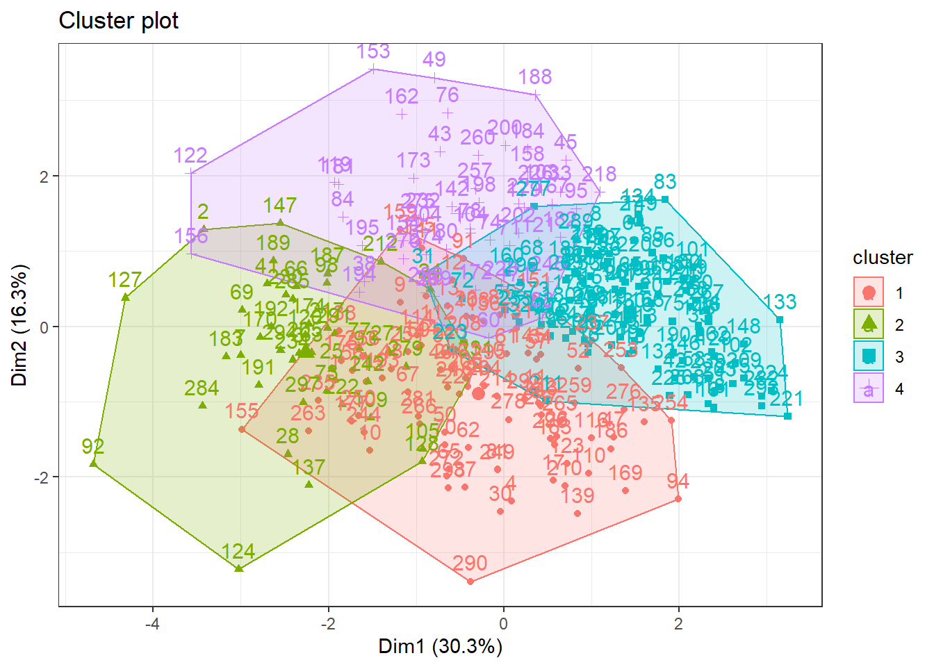 After trying distinct approaches using Hierarchical Cluster method the figure below illustrated the 4 clusters as silhouette method suggested. Thus, it is notable that this approach were not able to identify appropriately the cluster.
Let’s to try K-means method ❗️
In brief, K-means clustering is the most commonly used unsupervised machine learning algorithm for partitioning a given data set into a set of k groups (i.e. k clusters), where k represents the number of groups pre-specified by the analyst. It classifies objects in multiple groups (i.e., clusters), such that objects within the same cluster are as similar as possible (i.e., high intra-class similarity), whereas objects from different clusters are as dissimilar as possible (i.e., low inter-class similarity). In k-means clustering, each cluster is represented by its center (i.e, centroid) which corresponds to the mean of points assigned to the cluster. For more details click here
Checking optimal number of clustering using K-Means
fviz_nbclust(data_scaled, kmeans, method = "wss")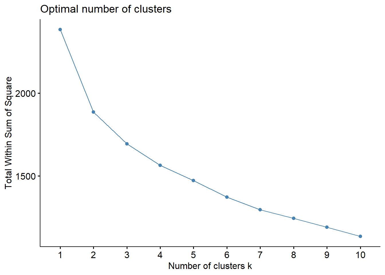
fviz_nbclust(data_scaled, kmeans, method = "silhouette")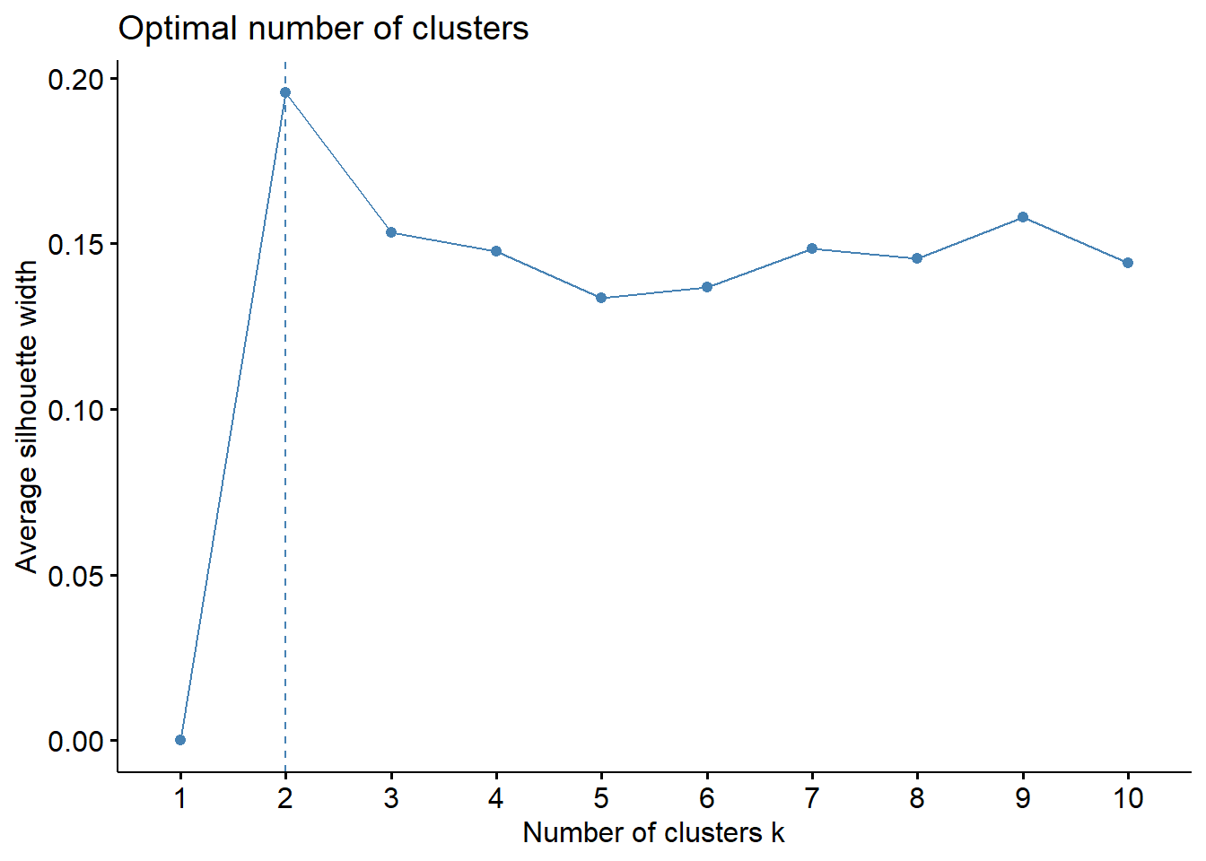
Differently of the hierarchical clustering, both elbow and silhouette method indicated 2 cluster in the dataset.
Let’s obsverve it ❗️
k2 <- kmeans(data_scaled,
             centers = 2,
             nstart = 25)

fviz_cluster(k2,data = data_scaled) +
  theme_bw()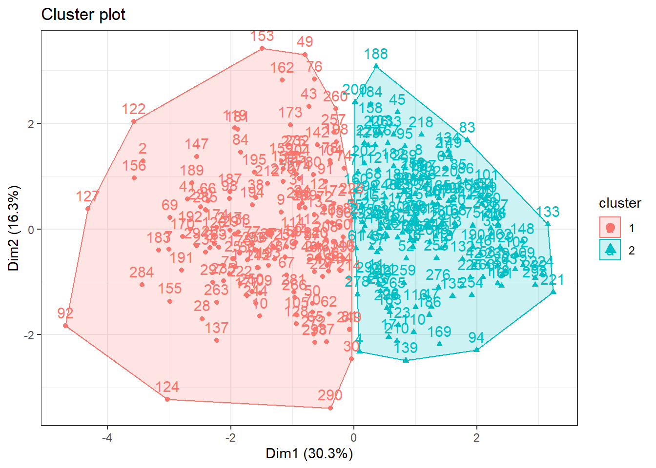
Wowww, now we are able to see clusters ❗️. Nice, but let’s to try some more cluster for us to see if something is better ❗️
k3 <- kmeans(data_scaled, centers = 3, nstart = 25)
k4 <- kmeans(data_scaled, centers = 4, nstart = 25)
k5 <- kmeans(data_scaled, centers = 5, nstart = 25)

# plots to compare
p1 <- fviz_cluster(k2, geom = "point", data = data_scaled) + ggtitle("k = 2")
p2 <- fviz_cluster(k3, geom = "point",  data = data_scaled) + ggtitle("k = 3")
p3 <- fviz_cluster(k4, geom = "point",  data = data_scaled) + ggtitle("k = 4")
p4 <- fviz_cluster(k5, geom = "point",  data = data_scaled) + ggtitle("k = 5")

grid.arrange(p1, p2, p3, p4,
             nrow = 2) +
  theme_bw()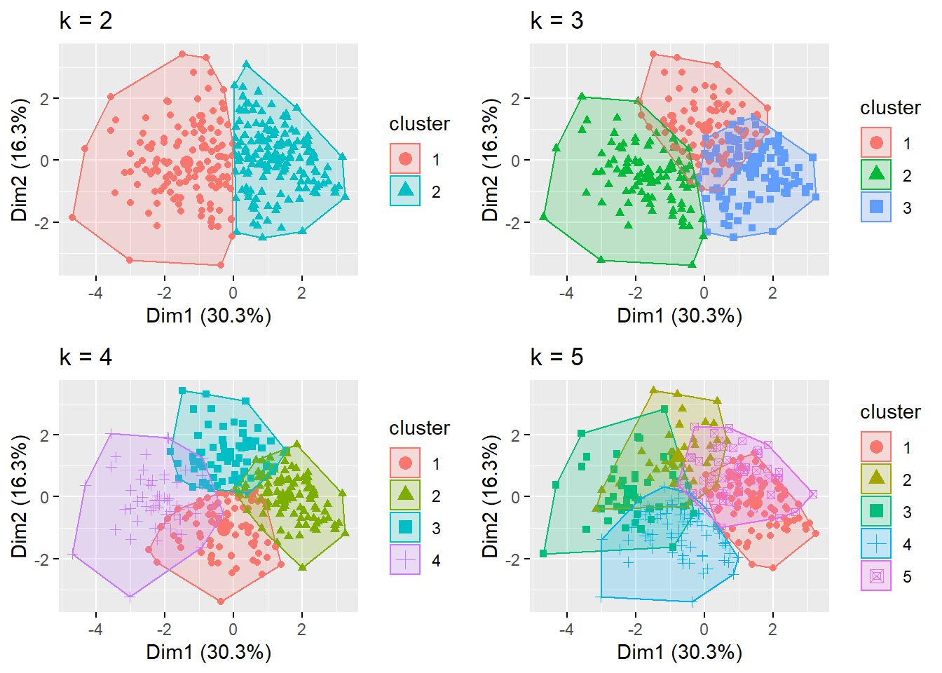
## NULLObserving plots above, we can observe that elbow and silhouette methods indicated adequately the number of cluster, since that there are some overlaps when using more cluster.
Final
In the conclusion, the K-means method with 2 cluster appear to offer an adequate clusterization of the heart disease dataset. Thus, this algorithm would may be utilized to determine specific medical care for each cluster of patients. It is noteworthy that the analyses performed herein are not intended to be used in practice. However, these analysis reinforce the utilization of unsupervised machine learning in the health care scenario.
Hope you enjoyed it!😜!

- Posted on:
- June 22, 2022
- Length:
- 7 minute read, 1380 words
- See Also: